GRAPHIC

GRAPHIC

PAGE 02
BRAND IDENTITY
academy project
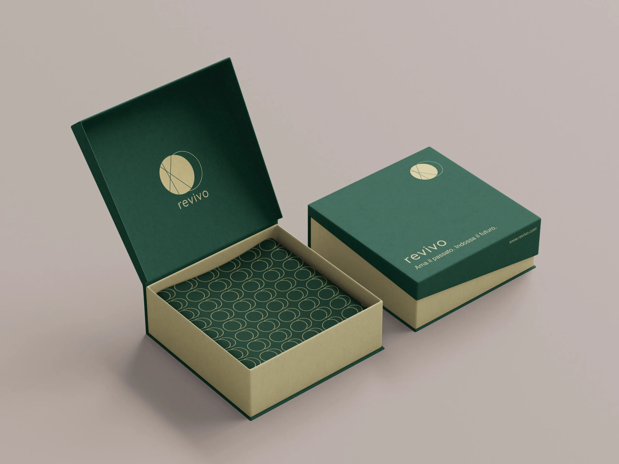
REVIVO
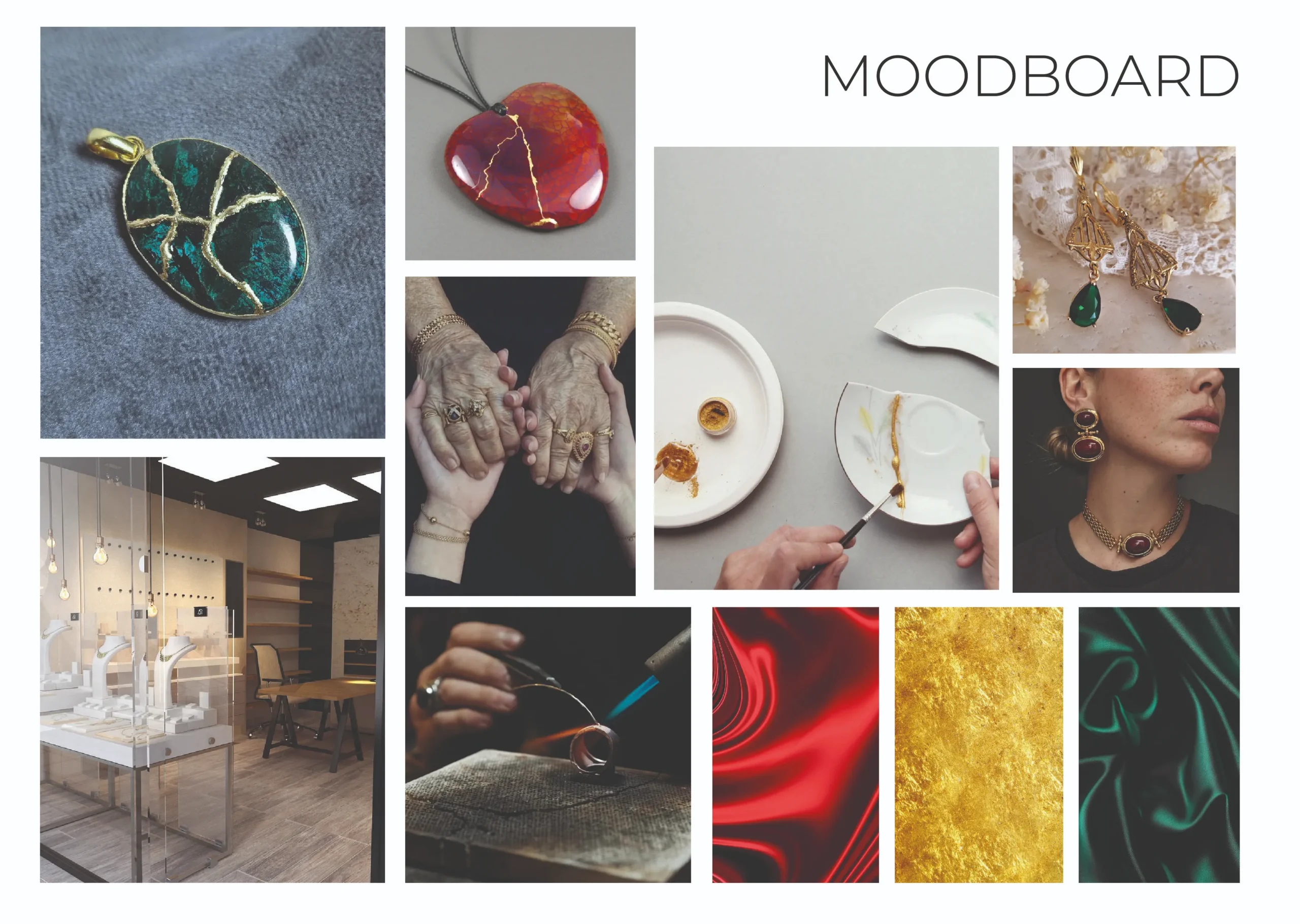
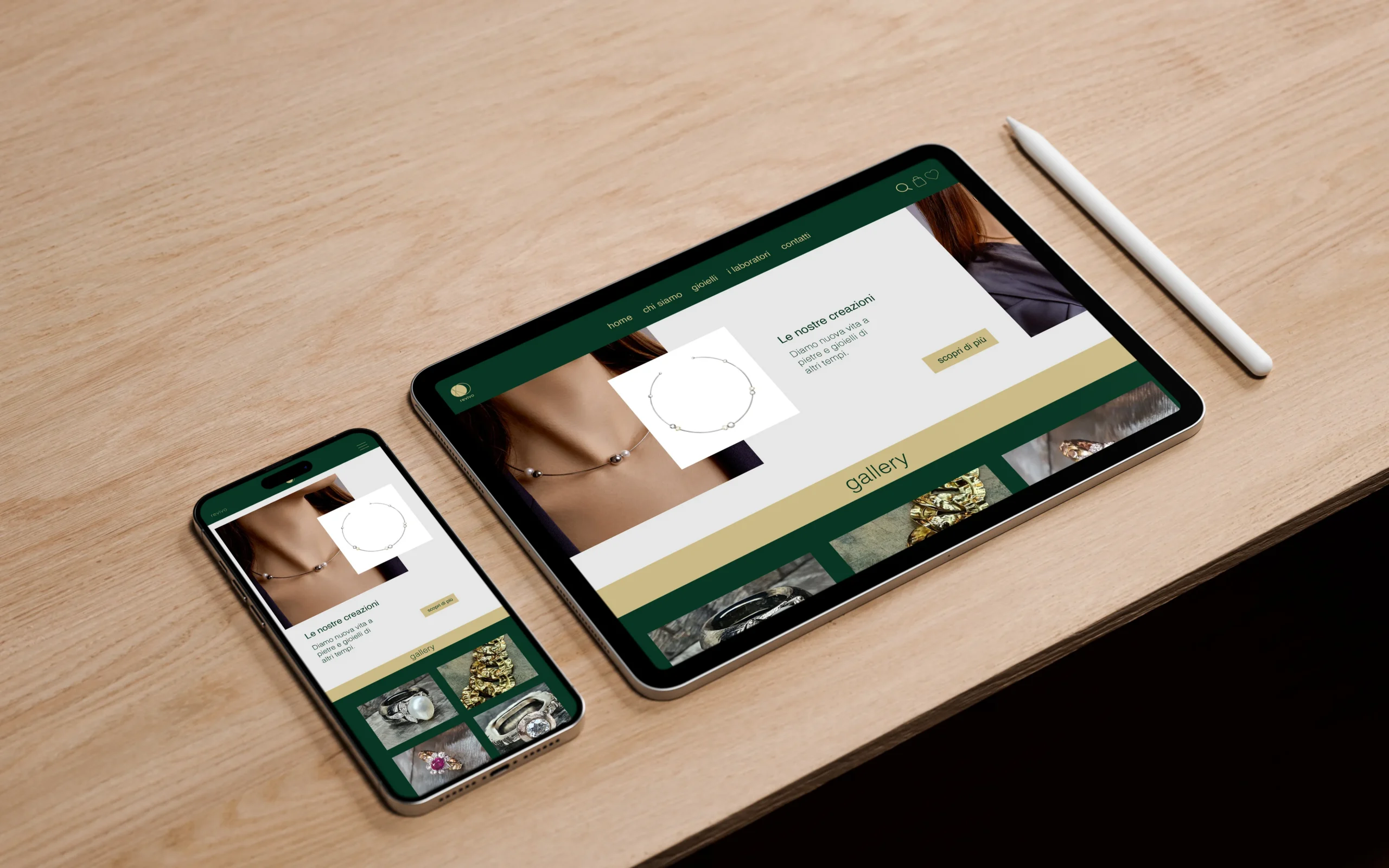
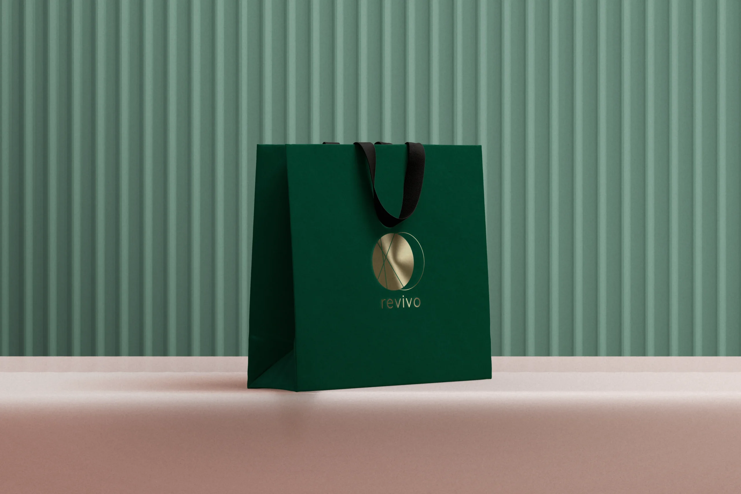
ReVivo is an Italian sustainable jewelry brand specializing in the restoration and transformation of existing rings.
Through a carefully crafted artisanal process, ReVivo gives new life to jewelry pieces rich in history, preserving their emotional and cultural value. The brand stands out for its attention to customers, transparency in the sourcing of materials, and a minimalist, elegant aesthetic. Dedicated to a conscious audience sensitive to environmental issues, ReVivo promotes a new way of experiencing luxury: personal, responsible, and timeless.
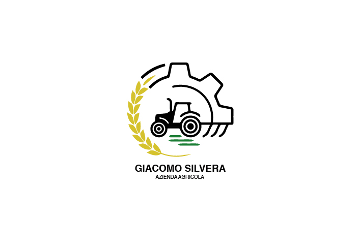
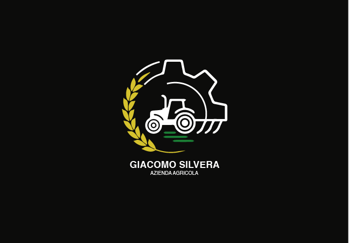
FARM LOGO
Visual identity project developed for a privately commissioned agricultural business. The logo was designed to convey authenticity, a strong connection to the land, and product quality through a clean and contemporary visual language. The design process included concept research, analysis of the brand’s core values, exploration of multiple design directions, and refinement of the final solution. The resulting identity was created to ensure strong recognition, versatility, and effective application across both digital and printed media.
DIGITAL ANIMATION
2d- animation
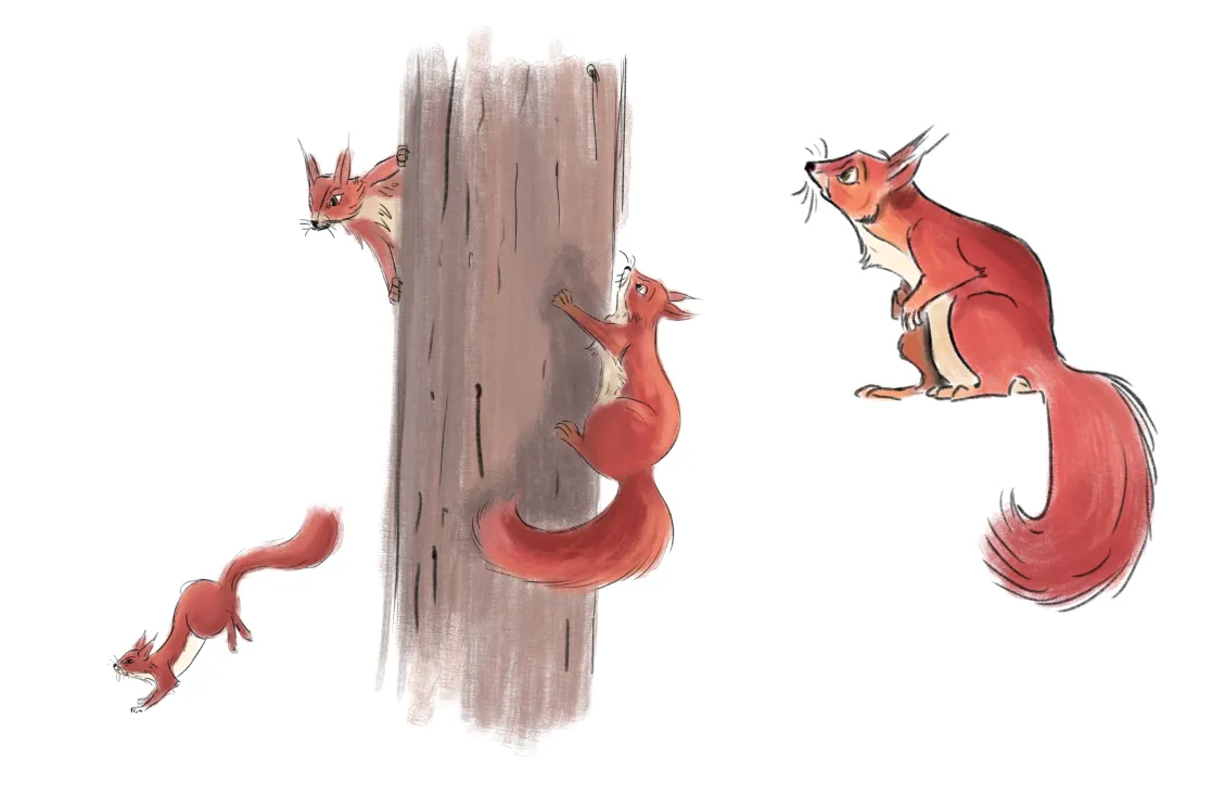
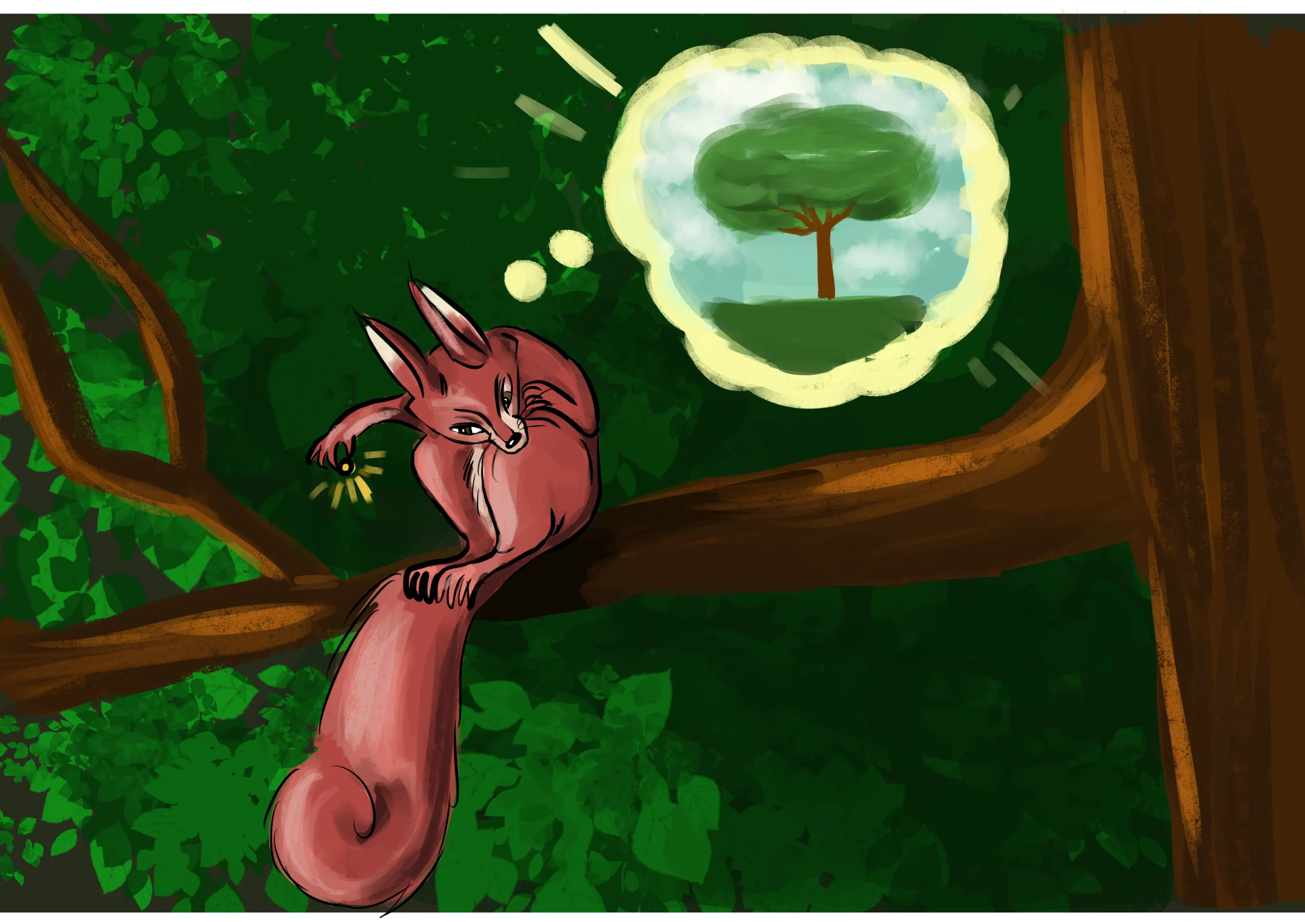
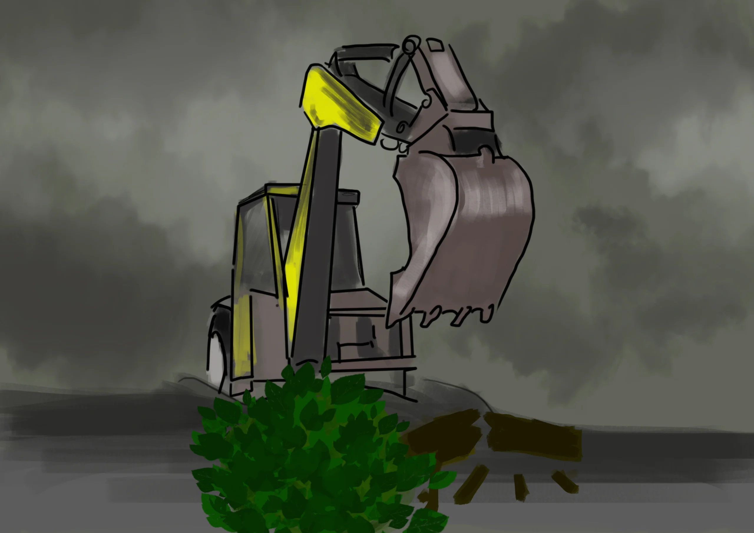
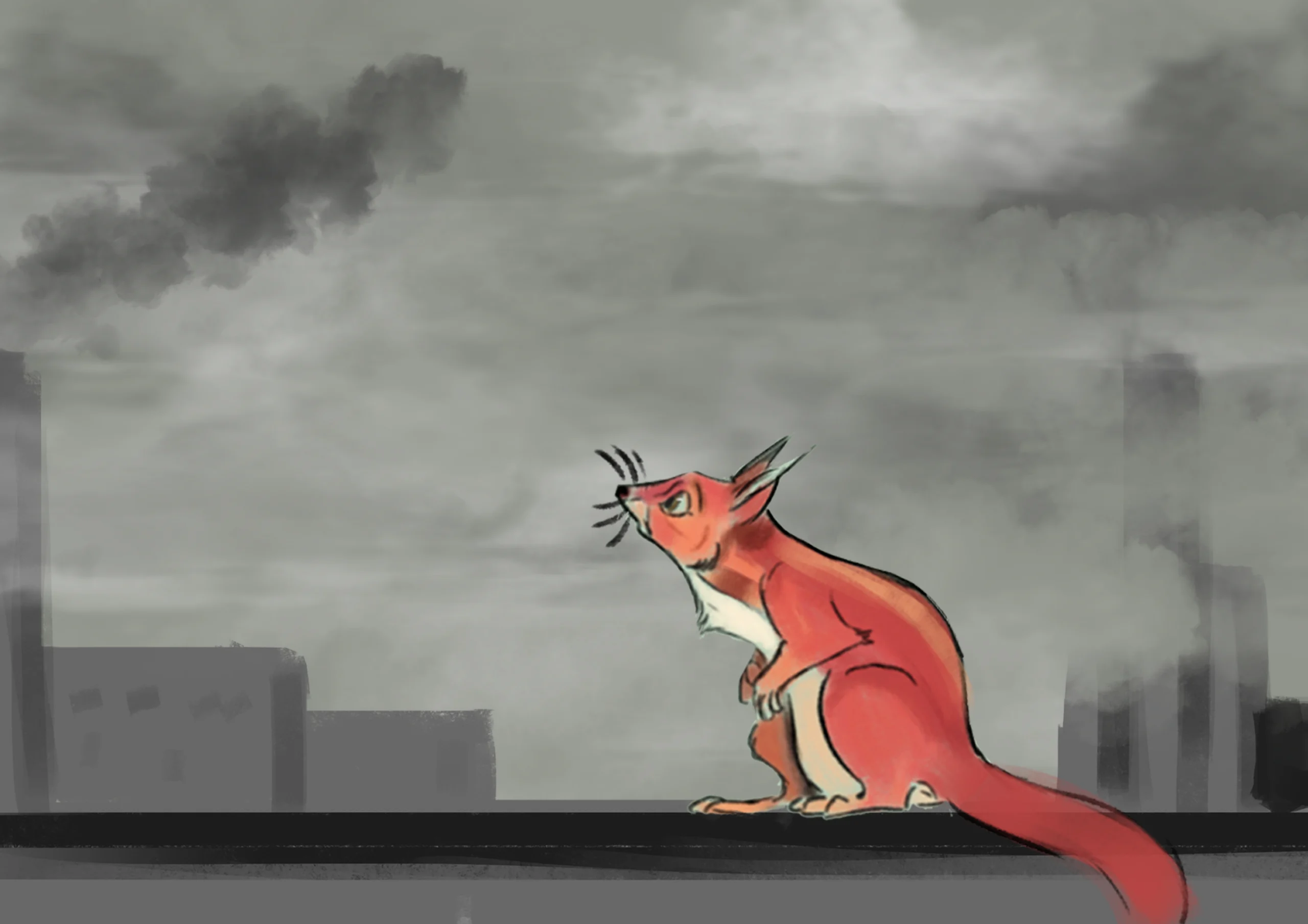
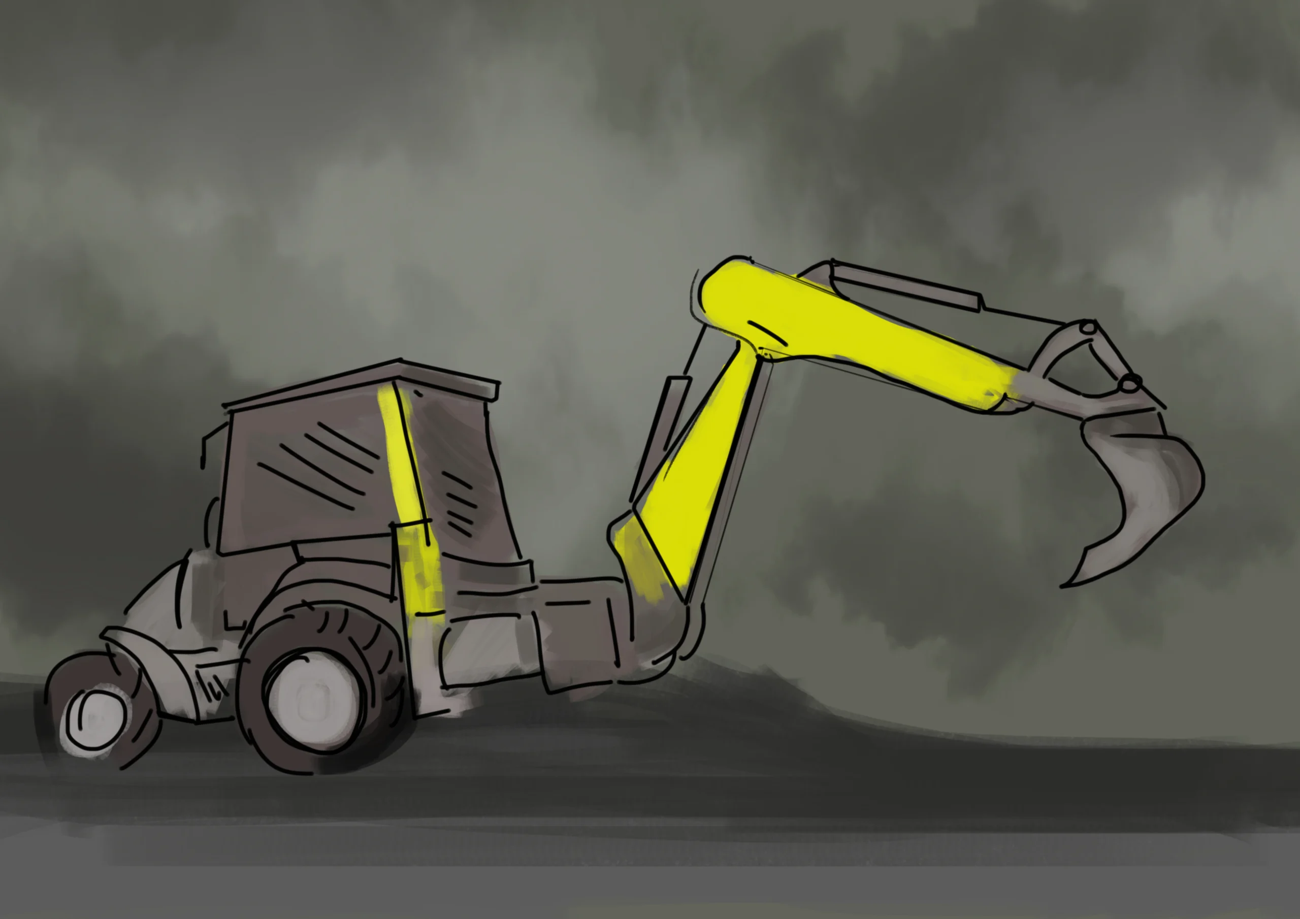
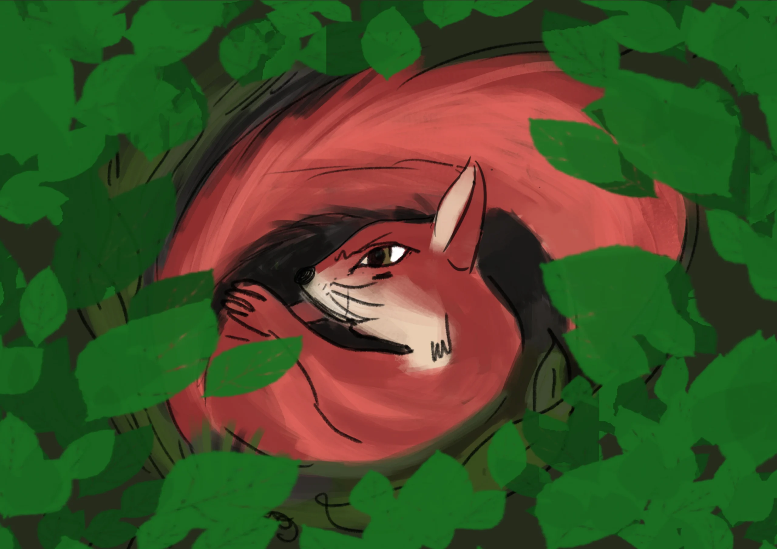
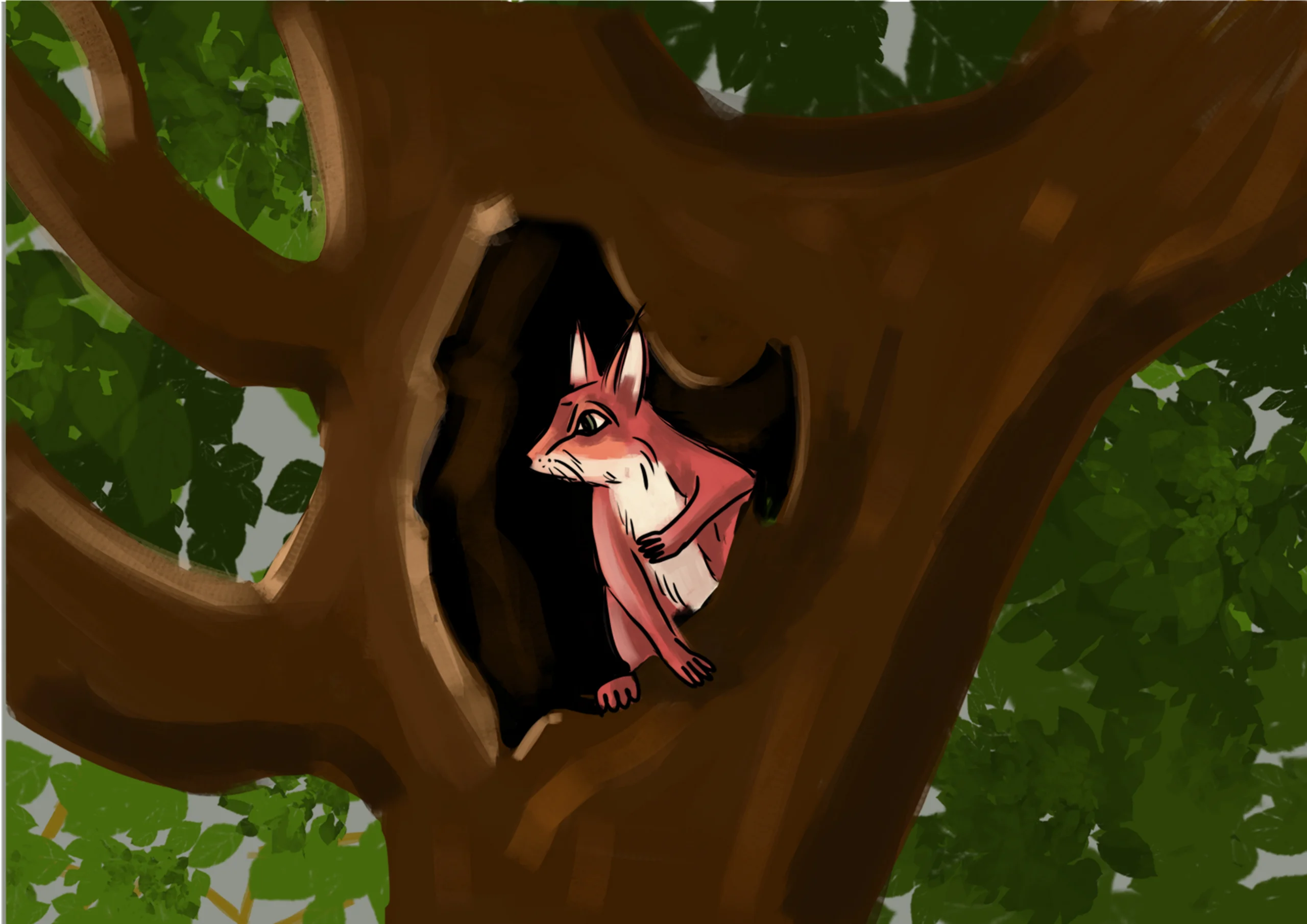
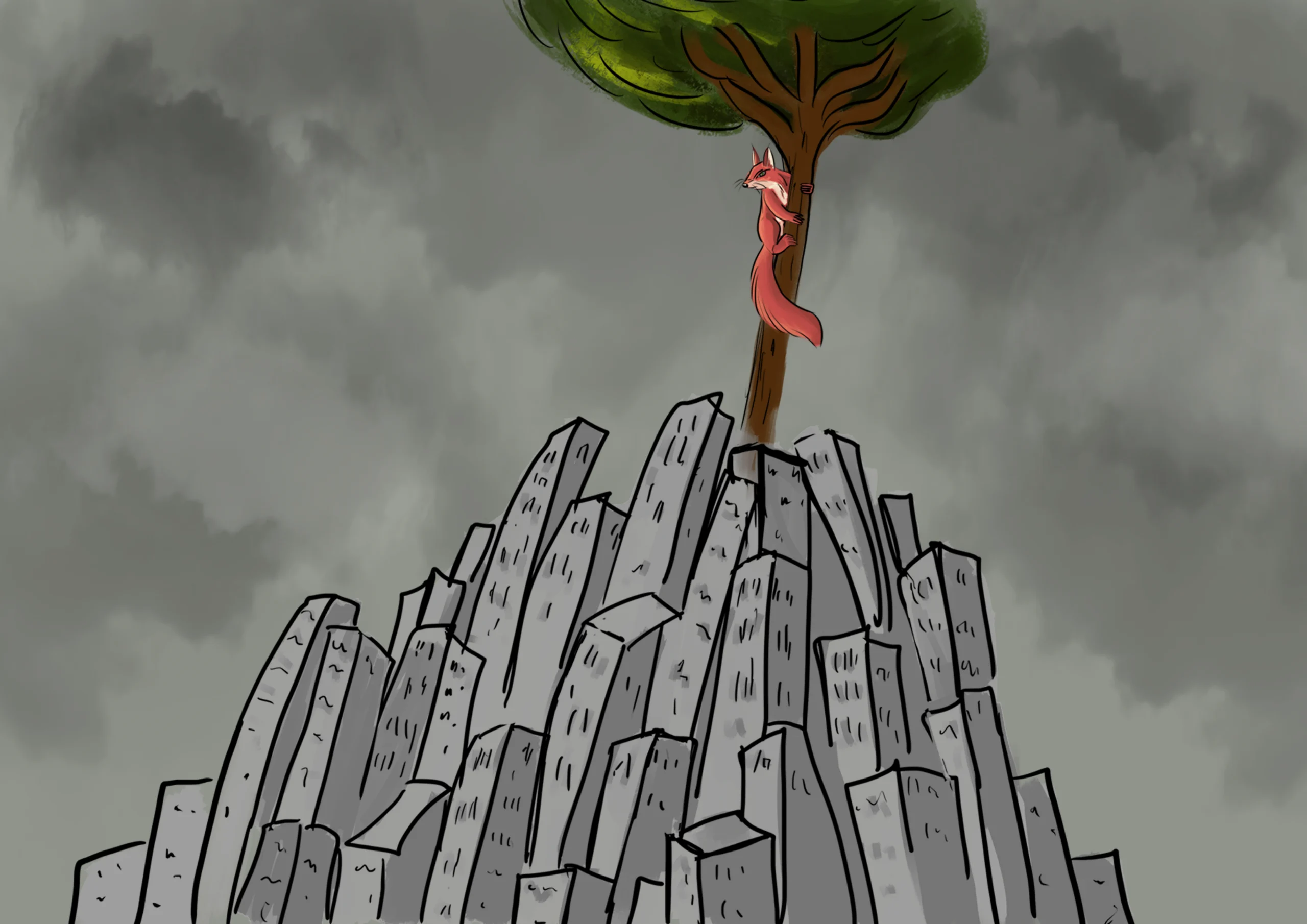
JUST A NIGHTMARE OR NOT?
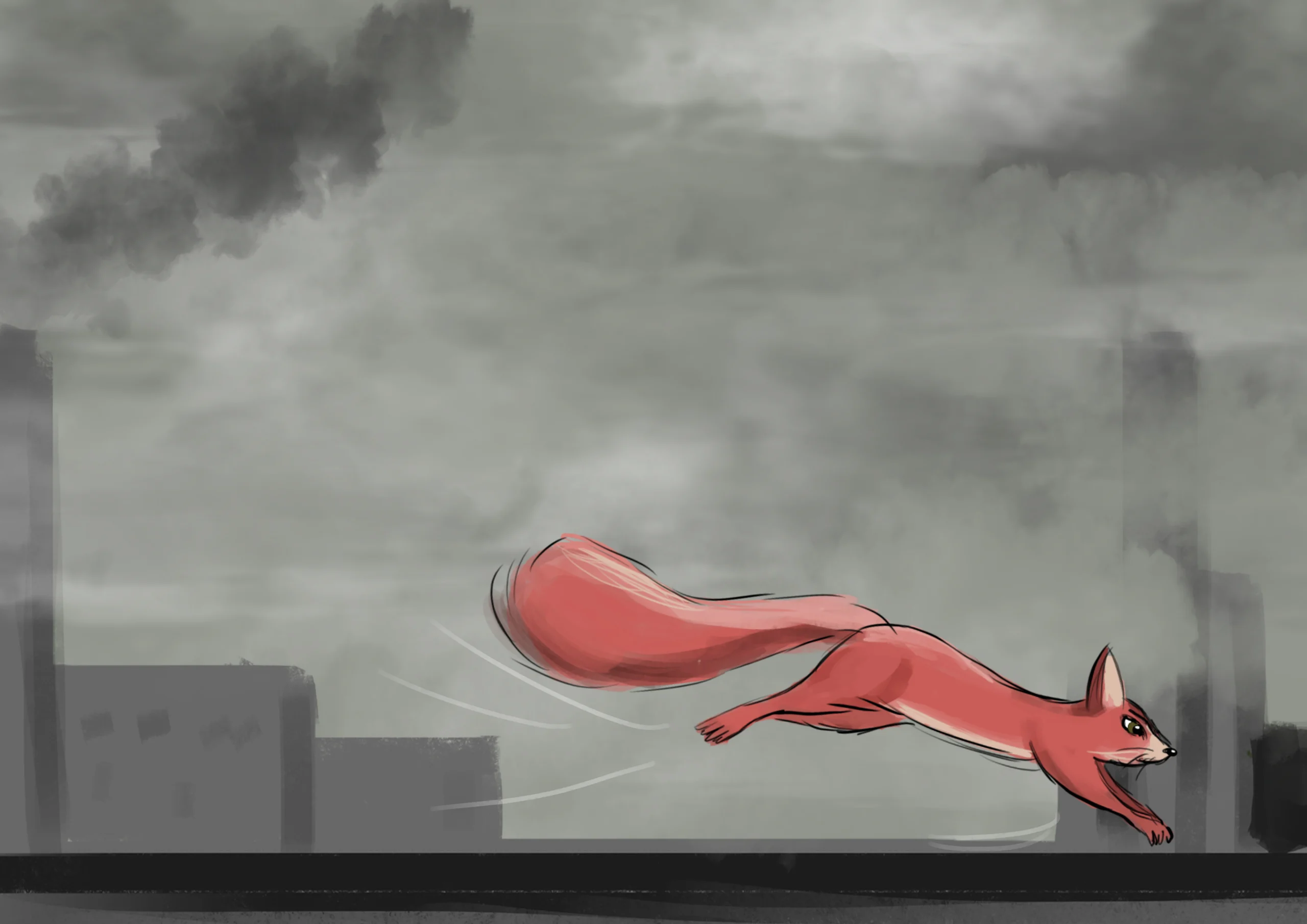
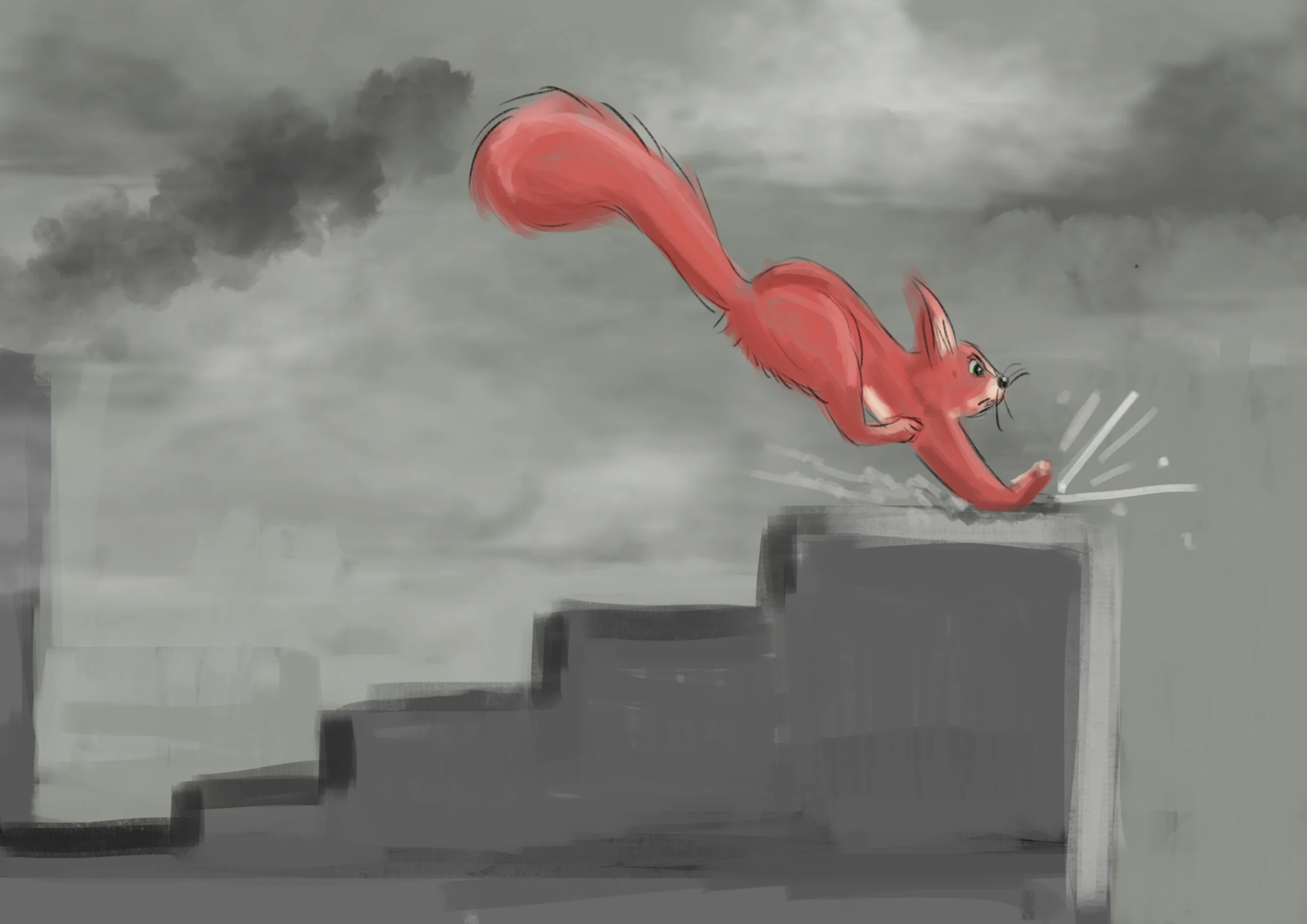
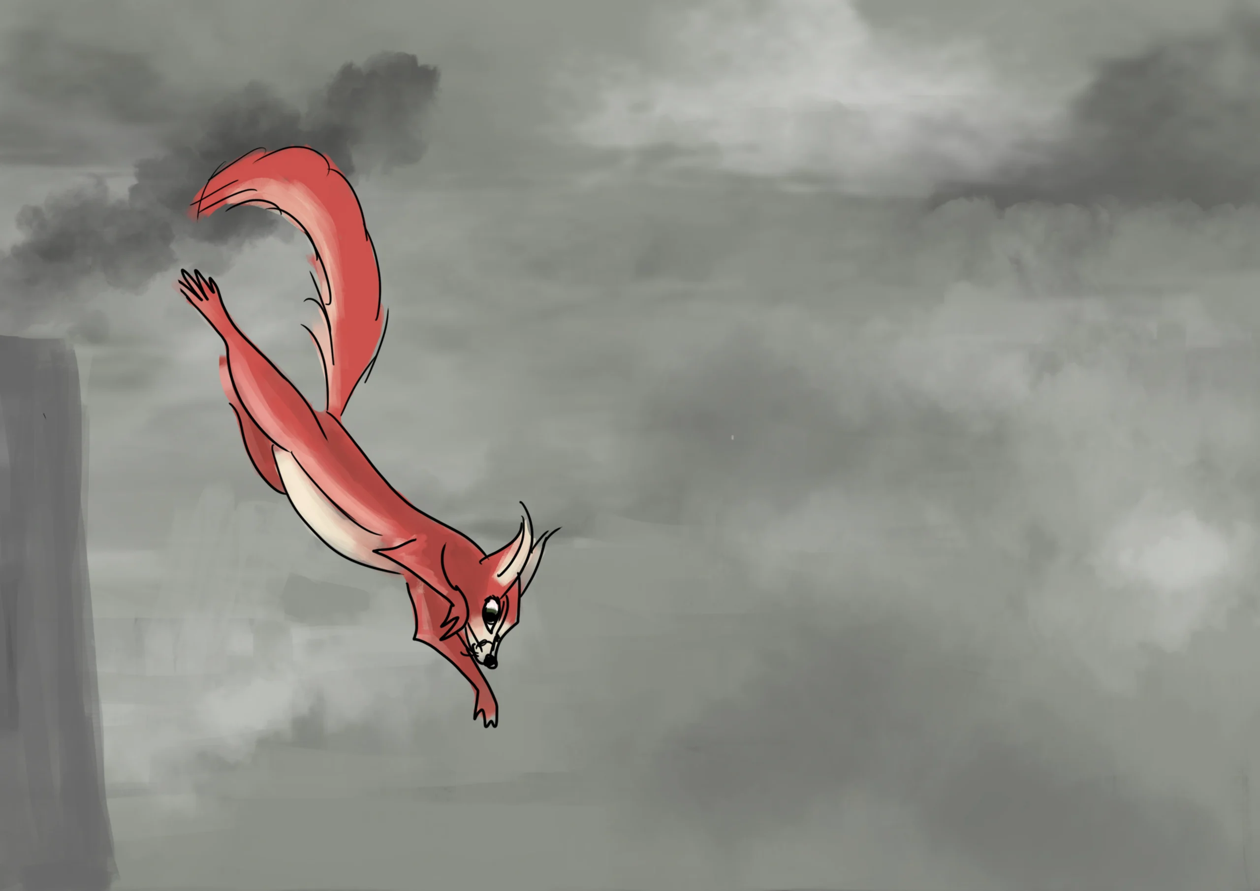
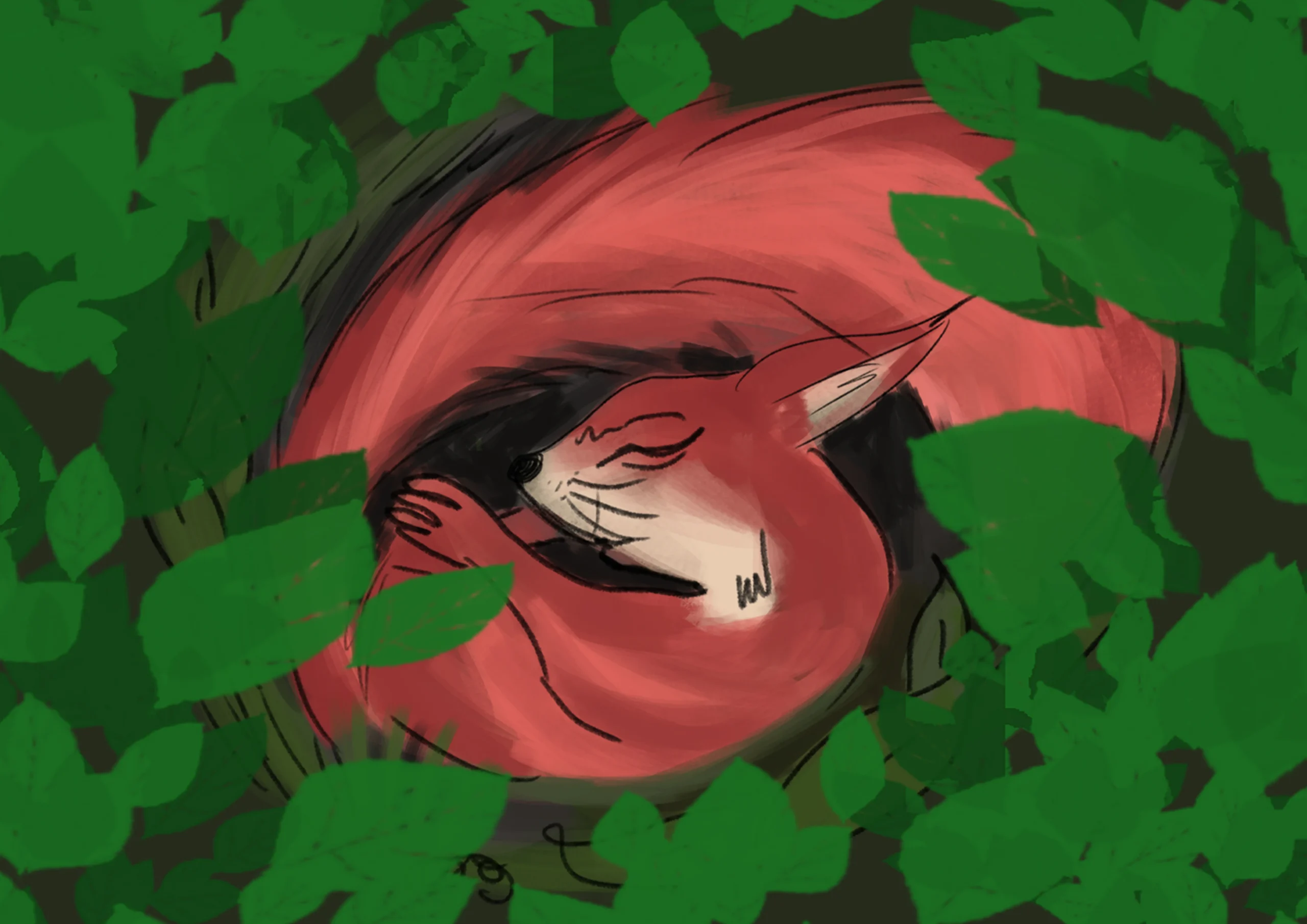
A 2D animated short film following the journey of a squirrel forced to flee as its natural habitat is destroyed by bulldozers, deforestation, and urban expansion. Through expressive character animation and dynamic storytelling, the project explores themes of environmental loss, displacement, and the impact of human development on wildlife. The animation combines cinematic pacing, emotional visual language, and stylized 2D techniques to create an engaging and thought-provoking narrative aimed at raising awareness about sustainability and conservation.
CHARACTER DESIGN
STORYBOARD
ILLUSTRATION CREATED IN PHOTOSHOP
ANIMATION
 CREATED IN BLENDER
Esempio Video

DESIGN

DESIGN

PRODUCT
academy project
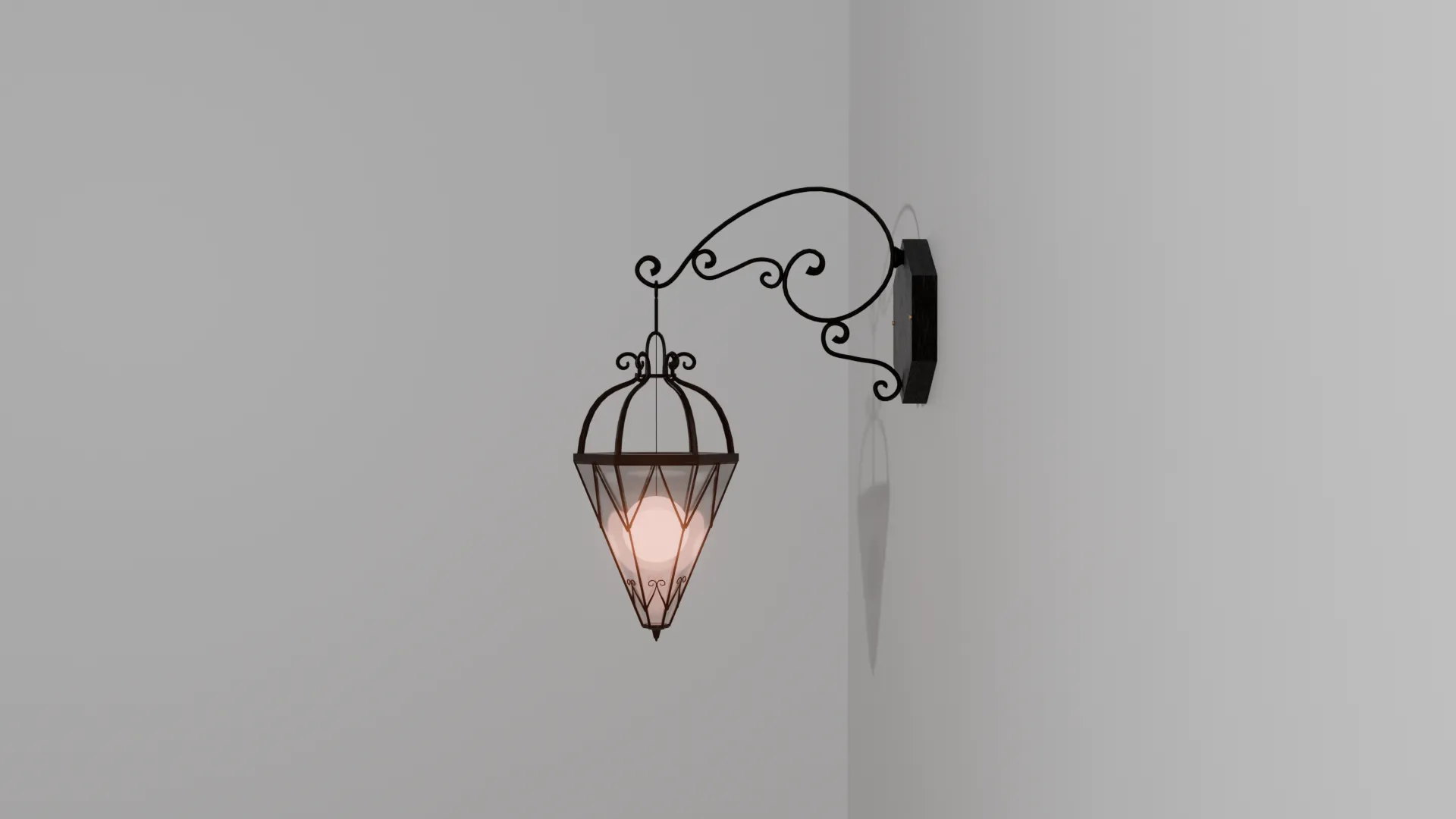
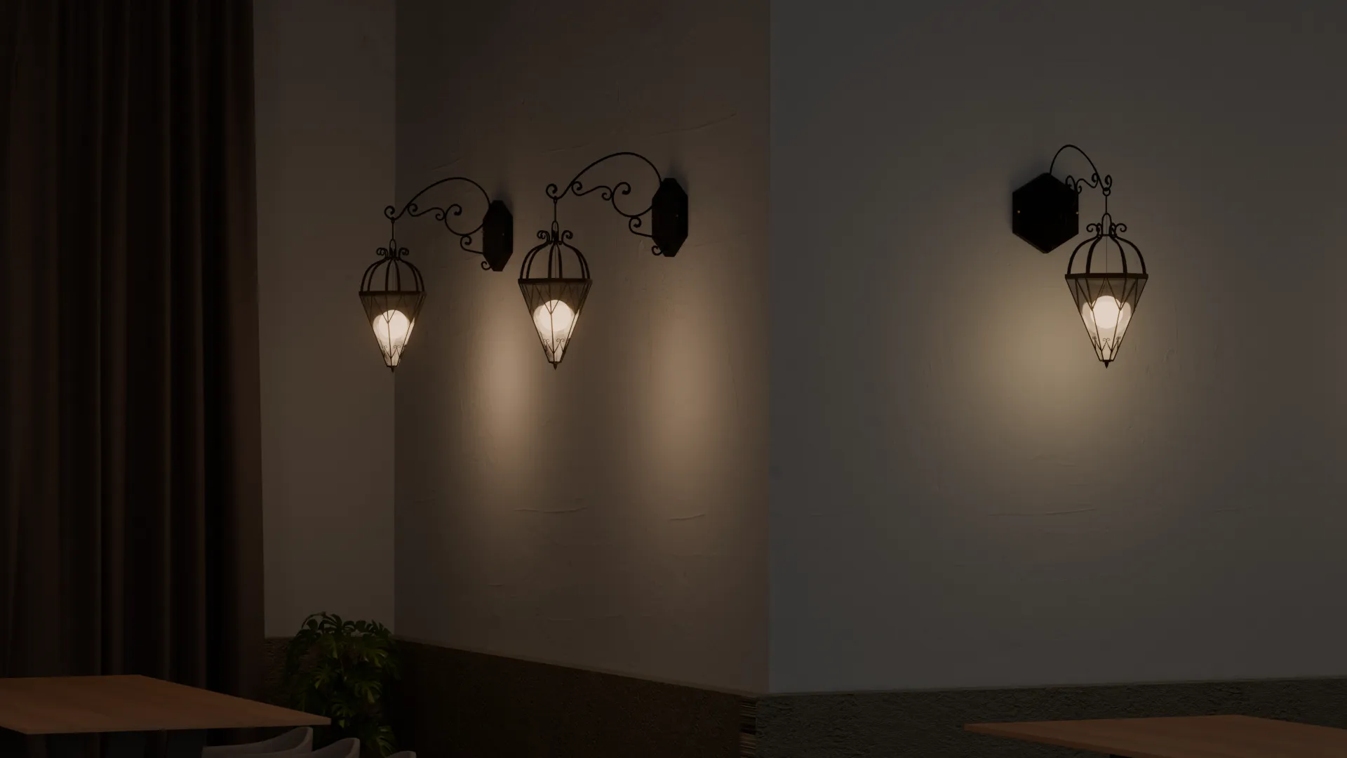
EMBERWELL
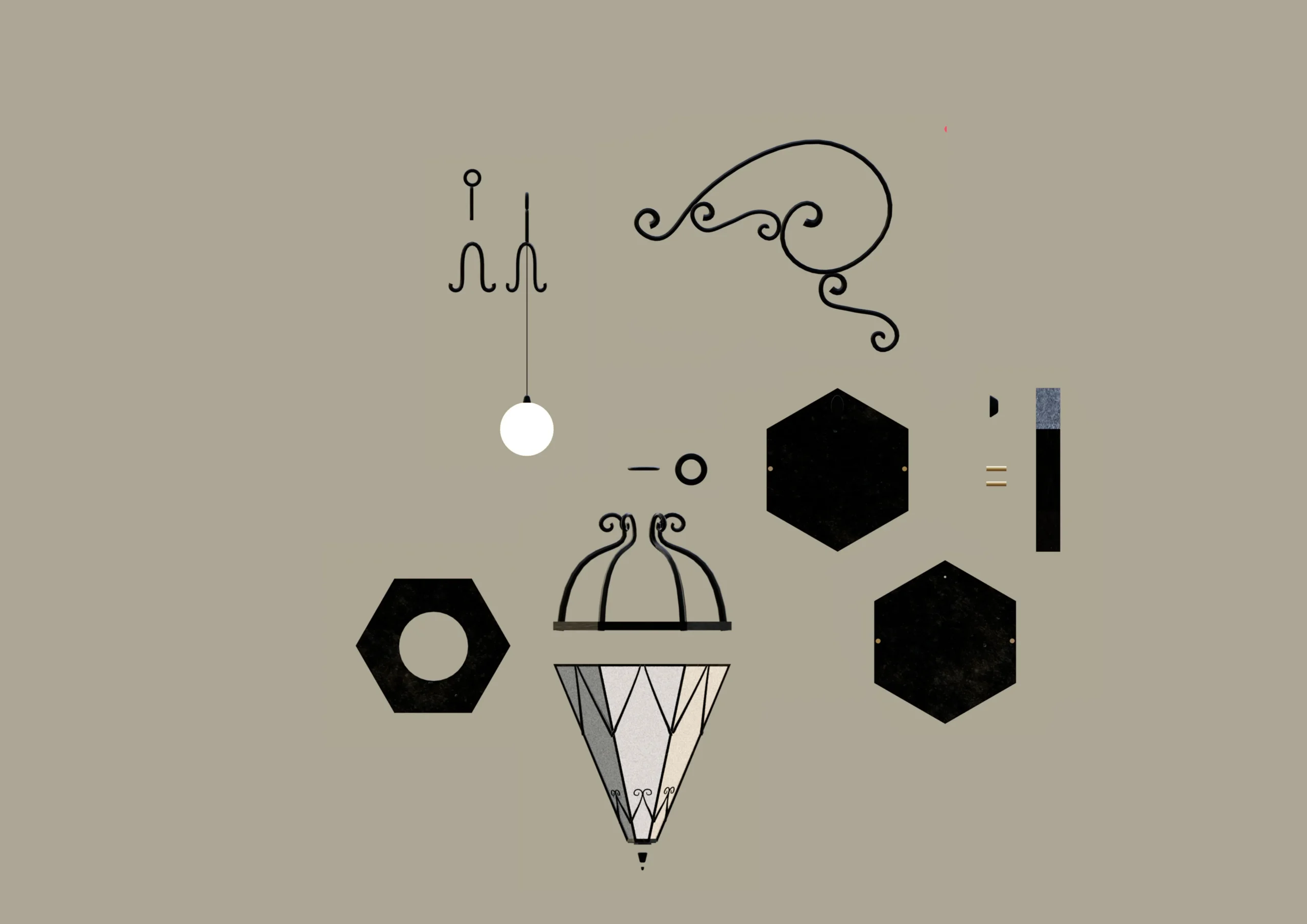
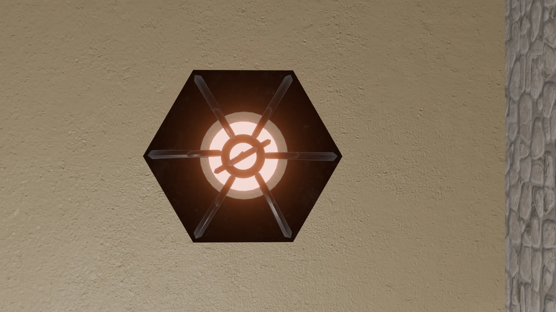
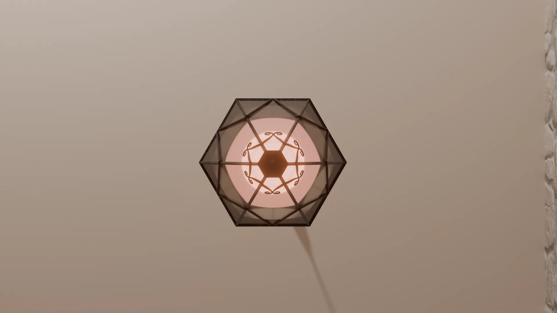
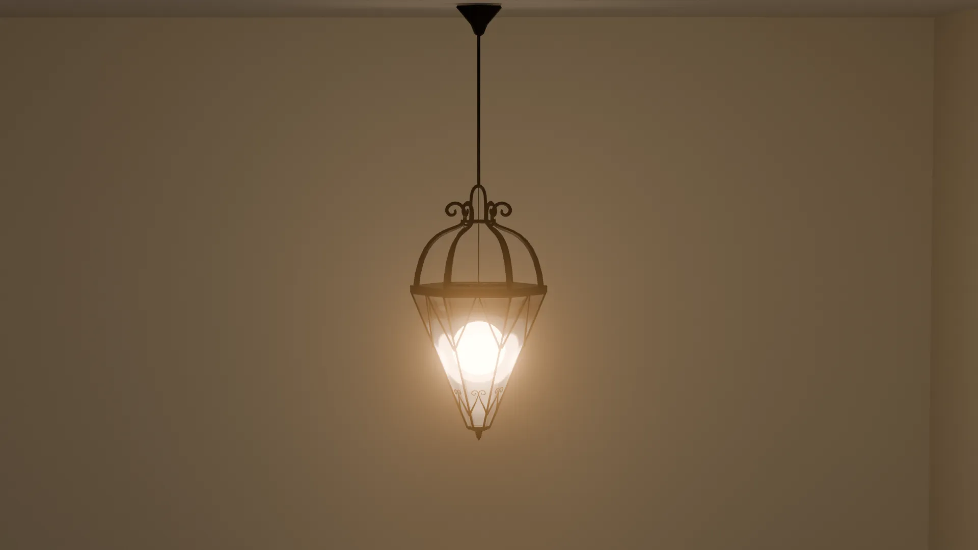
The lamp design is inspired by the shapes of an ancient medieval well, resulting in a lantern that recalls the style of the Middle Ages with an elegant and warm aesthetic. Intended for indoor environments, it is available in two versions: a wall-mounted model and a ceiling-mounted one.
PRODUCT & BRAND IDENTITY
academy project
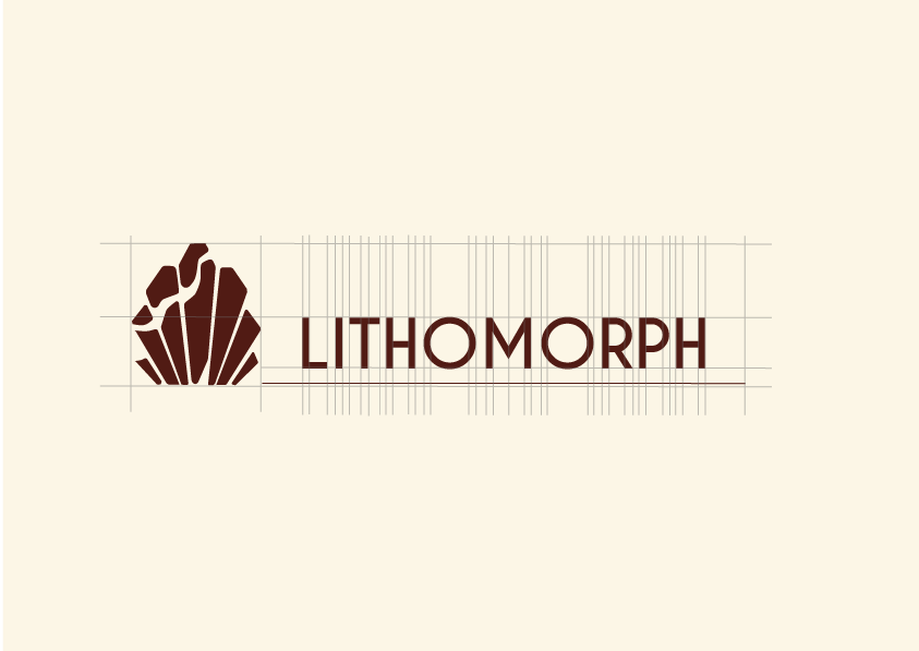
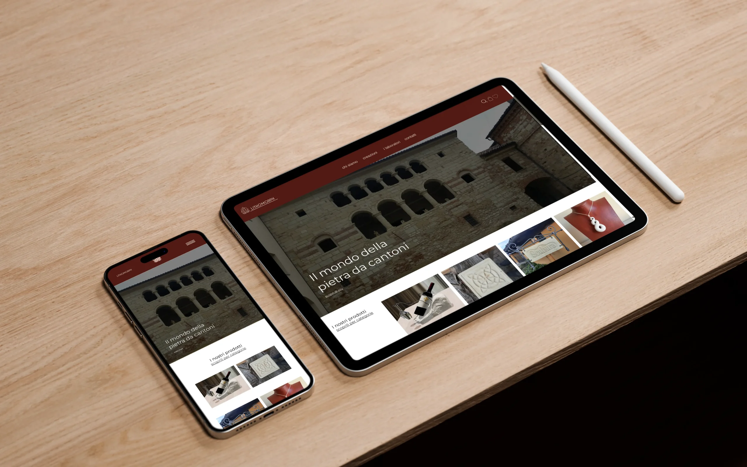
LITHOMORPH
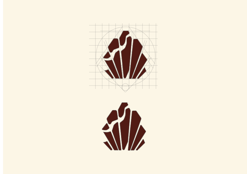
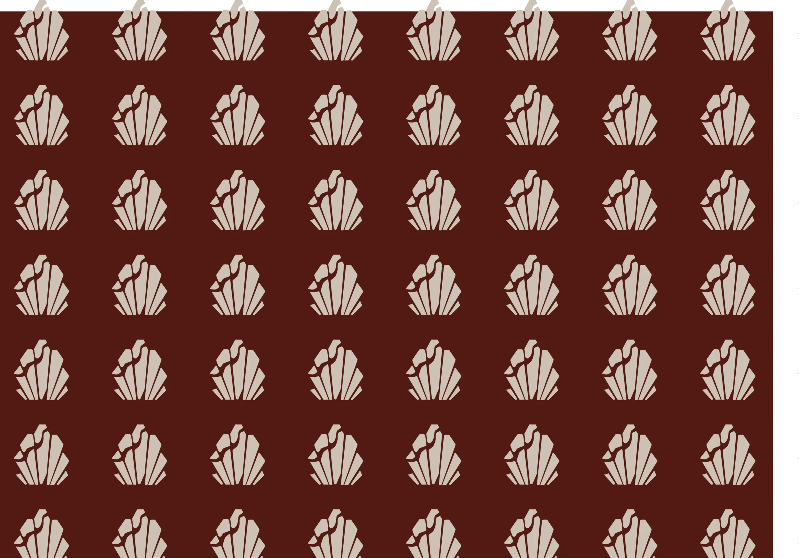
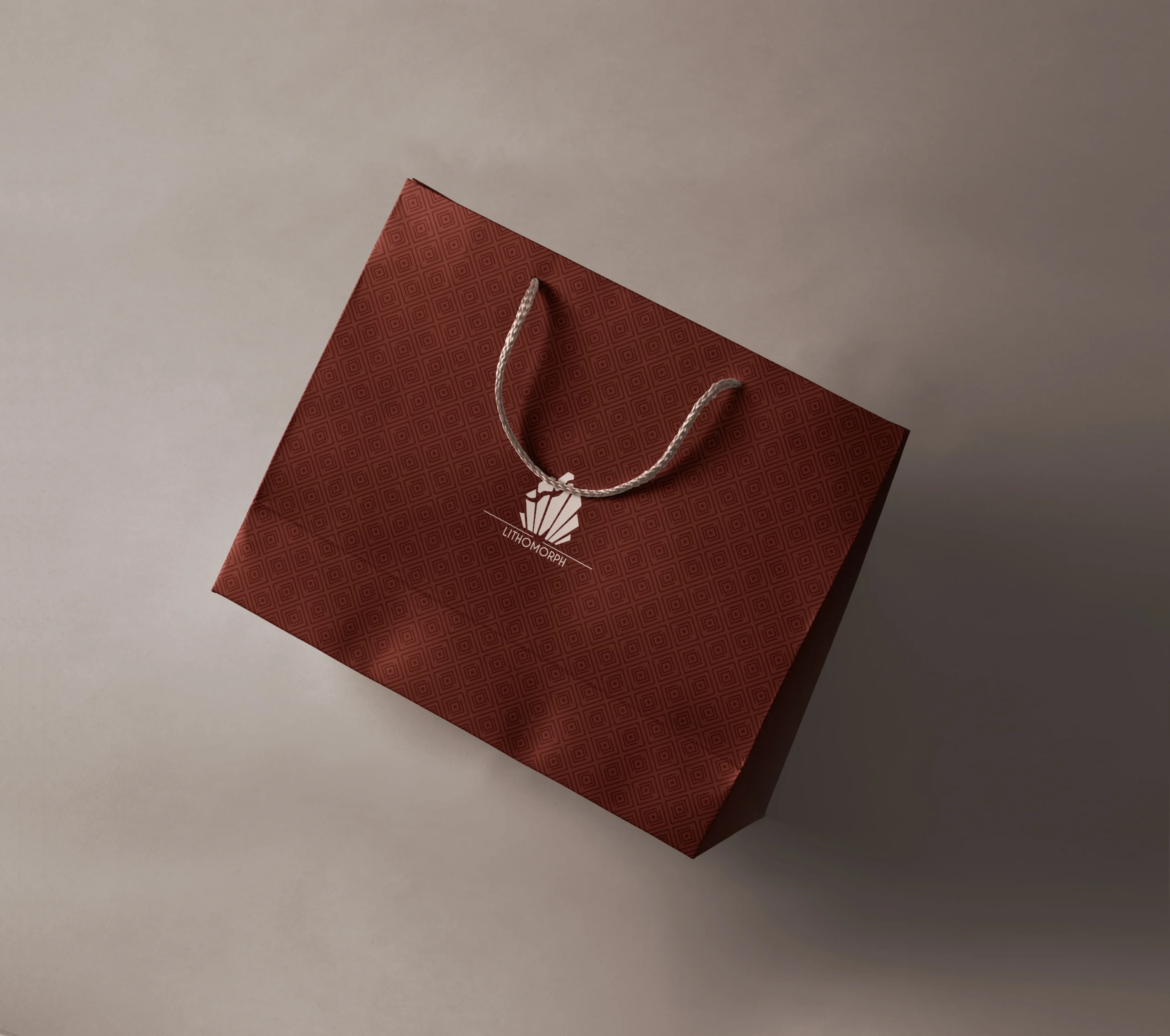
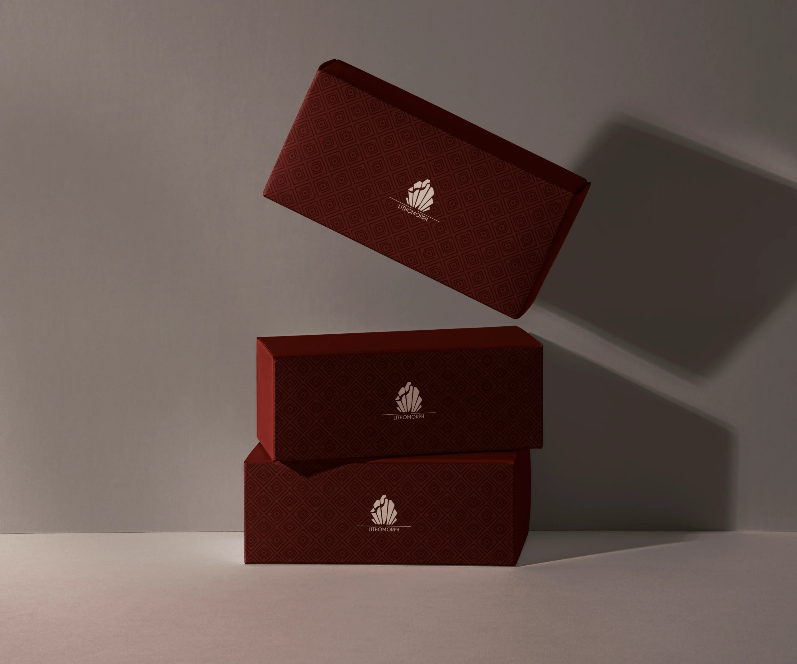
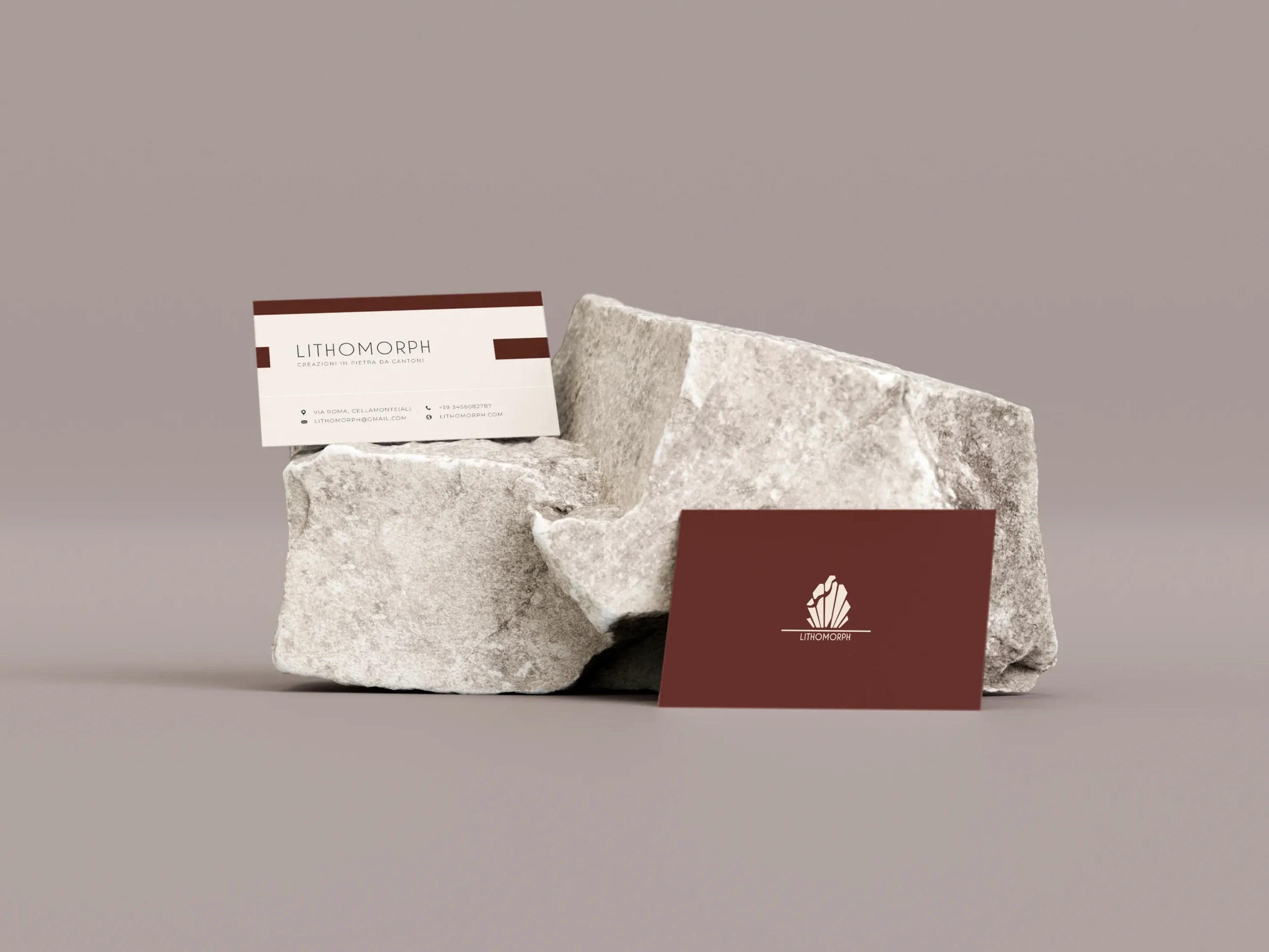
The name LITHOMORPH comes from the fusion of “lithos” (stone) and “morphē” (form), evoking the shaping of stone into functional and design objects. The logo recalls the broken yet harmonious geometries of a stone opening apart, while also suggesting the stylized profile of a marine fossil — a memory preserved within the rock of a submerged world.
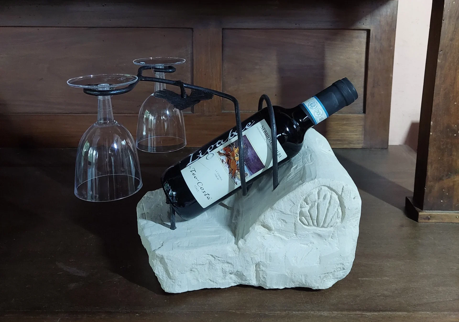
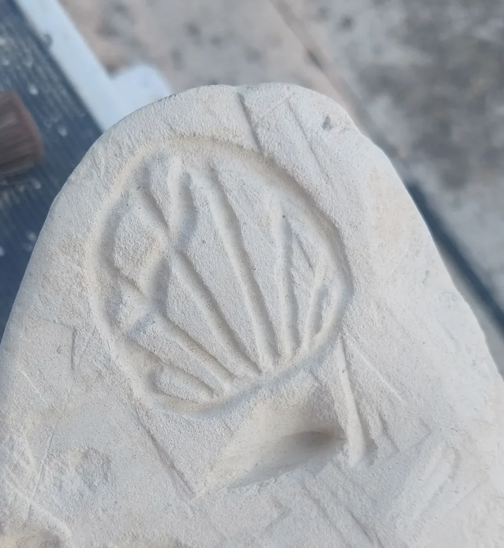
Pietra da Cantone, the main material used in the creations, is a sedimentary stone of marine origin. It was formed on prehistoric seabeds, where sand, shells, and marine organisms accumulated and compacted over thousands of years into layered stone. Ancient traces still survive within it, such as fossilized shells.
WEB DESIGN
academy project